The
Hidden Sphere
(of Artistic Concerns) Cecil Orion
Touchon
Johannes Itten and important texts on color, design and
composition

The
Art of Color: The Subjective Experience and Objective Rationale of Color
by Johannes Itten
This book might be expensive, but what do you expect for such genius.
I love this book, and would recommend it to anyone into color theroy. Itten
is a color genius, and this book proves it.

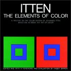
The
Elements of Color by Johannes Itten, Faber Birren
Reviewer from Chicago
I have been a professor for 15 years. "The Elements of Color" has been
required reading for many of my courses. It is not only enriching as a
color theory document, but it helps expand the artist or designers possibility
of using, arranging and conceiving color.

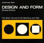
Design
and Form: The Basic Course at the Bauhaus and Later, Revised Edition
by Johannes Itten, Johannes Atten
Itten made the world as we know it today. Without his guidence, none
of the products you buy, art you look at, or anything else would be what
it is today. If you are a designer or art monger, you owe it to yourself
to read this book. It is a discription of his Basic Course (everyone had
to take it...) at the Bauhaus in Weimar written by Itten himself.

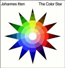
The
Color Star by Johannes Itten
This an absolute must for all people who work with fibre, paint or
just want to understand colour. The ultimate colour wheel.
Related books to consider

Interaction
of Color by Josef Albers
Josef Albers was the Johannes Kepler of color. Kepler spent his life
observing planetary motion, and distilling his observations down to simple
laws of gravity. Change planets to color, and gravity to human vision,
and you have Josef Albers. This book describes the gravitational laws of
color. It has the whiff of simple perfection: you can't change one word
without diminishing it. It is the bible of color interaction, and will
remain so until an Isaac Newton comes along and explains these laws further.
In the rare book collection, I had a look at the first edition, from
1963. It's this enormous book with lots of colored paper and plates for
you to experiment with. I really wish it were still in print... I'd buy
it at once.

The
Prints of Josef Albers : A Catalogue Raisonne, 1915-1976
by Brenda Danilowitz, Josef Albers, Josef and Anni Albers Foundation,
Nicholas Fox Weber
From Publishers Weekly
The Prints of Josef Albers: A Catalogue Raisonne 1915-1976 collects
the graphic works of the legendary abstract artist and Bauhaus design teacher.
Early woodcut self-portraits, increasingly abstract lithographs, the famous
Homage to the Square, and 10 prints that are the beginning of Albers's
experiment in color are all featured here, as are the posters, album covers
and greeting cards that Albers created toward the end of his career. The
pieces were culled by Brenda Danilowitz, chief curator of the Josef and
Anni Albers Foundation, who's written a lucid introductory essay on the
evolution of Albers's oeuvre.

Toward
a Psychology of Art : Collected Essays by Rudolf Arnheim

The
Dynamics of Architectural Form : Based on the 1975 Mary Duke Biddle Lectures
at the Cooper Union by Rudolf Arnheim
Art
and Visual Perception : A Psychology of the Creative Eye by Rudolf
Arnheim
The
Power of the Center : A Study of Composition in the Visual Arts : The
New Version
by Rudolf Arnheim
The book reads like a complicated mathematical college text book. The
author either tries to impress you with his knowledge of the english language
or confuse you with the ideology behind his observations in artistic composition.
I found the book to be very confusing and at times boring enough to put
it aside and read something else. The author does relate some good input
when critiquing paintings but you need pay complete attention to the beginning
of the book in order to understand his complicated formulas. It is definetely
not an easy read, and not for the artist. This book is for the art critic
who tries to find scientific formulas for the study of composition.

The
Principles of Harmony and Contrast of Colors and Their Applications to
the Arts
by M.E. Chevreul, Faber Birren
Book Description
This monumental masterwork by the renowned nineteenth century scientist
and authority on color, M.E. Chevreul, is unquestionably one of the greatest
books ever written on color; the first English translation is reprinted
here with the original color restored and an introduction and explanatory
notes by Faber Birren, the leading color authority of the present time.
Chevreul's book dominated the schools of Impressionism and Neo-Impressionism,
and exerted profound influence on later schools of painting including today's
Op Art. Chevreul set forth principles that have become basic in color training
throughout the Western world. In his illuminating commentary Mr. Birren
shows how many of Chevreul's ideas on color harmony, contrast effects,
optical mixtures, and legibility have been validated by modern scientific
research in visual perception. mr. Birren also provides a helpful glossary
of Chevreul's terminology. Lavishly illustrated, the volume contains many
color plates, including 15 plates from the original French edition, photographs
of Gobelins tapestries, and full-page reproductions of outstanding Impressionist
and Neo-Impressionist paintings. Essential as a reference book for artist
and art educators, this volume will also be a source of fresh inspiration
for fashion designers, interior decorators, and all others concerned with
color in any medium-and it makes good reading for all those interested
in the history of men and ideas.

Color
and Culture : Practice and Meaning from Antiquity to Abstraction by
John Gage
Reviewer from Mesa, Arizona, USA
This book is an excellant source of palette development, pigment uses
and development as well as color theories throughout history. My students
have worn out my copy -- needs to be reprinted and made known in college
art departments. Good, solid informational writing and illustrations. A
must-have book for artists and students.

Color
and Meaning: Art, Science, and Symbolism by John Gage
Reviewer from Dallas, Texas
John Gage, the most thorough and clear-thinking historian of color
theory, has produced another superb book, rich in references and sound
historical bases from which we may go forward ourselves. There are a number
of things any reader will delight in finally grasping. With me, it was
that interesting distinction between pluralist and unified color modes
(page 224) that I finally understand; and there are many other sound explanations
that will delight the serious student of color. It is all the more baffling
that Gage never reaches a discussion of such things as Land's color theory
in relation to Polaroid, and even more important, the workings of color
in the computer and its printer. If there ever was a codification millions
of colors in relation to primaries it is in the design of these systems
used by all of us. Yet Color and Meaning reads as if the computer has not
yet been invented. I yearned to get to those chapters, but they were not
there. And I regret it.

Principles
of Form and Design by Wucius Wong
This book compiles Wucius Wong's earlier works "Principles
of Two-Dimensional Design", "Principles of Two-Dimensional Form", and
"Principles
of Three-Dimensional Design". It's a good reference for design conventions
(similarity, anomoly, gradation, radiation) with examples. Three-d section
uses geometric constructions and doesn't use plastic examples. Strong 2-d
resource. Less useful for 3-d.

Composition
in Art by Henry Rankin Poore
Reviewer: hamsterdance (see more about me)
This is one of the most thorough books in the teaching and analysis
of composition I've ever had the fortune to read. All my other art books
mention the neccessity of sound composition and eye movement but none give
the detailed breakdown of how that's accomplished or why it fails. This
book does. You aren't just told - it's broken down for you explicitly with
dozens of examples from famous paintings. All kinds of compositions are
examined.
Here is a list of the chapter titles and some (would be tiresome to
include it all) of what they teach
1. Balance - rules, scale of attraction, vertical/horizontal balance,
natural balance, apparant/formal balance, balance by opposition of line,
balance by opposition of spots, transition of line...etc, etc, etc.
2. Entrance and Exit - getting into the picture, getting out of the
picture
3. Circular Observation - circular composition, reconstruction for
circular observation
4. Angular Composition - the triangle, the vertical line in angular
composition, angular composition based on the horizontal, line of beauty,
structural line
5. Composition with One or More Units - 2 units, 3 units, groups, the
figure in landscape
6. Light and Shade - pricipality, gradation
Color Plates.....
If you really want to learn composition and get it down cold - get this
book. It's a priceless gem.

The
Designer's Guide to Color Combinations : 500+ Historic and Modern Color
Formulas in Cmyk
by Leslie Cabarga
The publisher, North Light Books , April 30, 1999
Synopsis
This unique and extremely usable resource for today's designer contains
100 years of great color combinations. It contains no color wheels or lengthy
discussions on color theory like you'll find in other books . . . just
500+ tried-and-true color combinations inspired by actual design work--from
posters to packaging to linoleum floors--created over the past century
by designers and artists who really understood color theory. Each section
includes real examples of work from a particular era, as well as dozens
of color combinations arranged like a designer would use them--in simple,
sample layouts showing which colors work well in the background, as borders,
for type, etc.
return
to index
|

